Graphic Designers
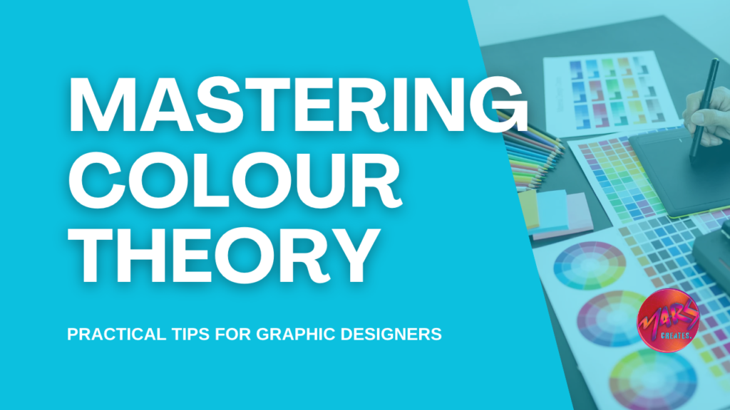
Color is a powerful tool in the hands of a graphic designer, capable of evoking emotions, conveying messages, and influencing perceptions. Understanding and mastering color theory is essential for creating visually appealing and effective designs. In this comprehensive guide, we’ll delve into the principles of color theory and explore how graphic designers .

The Basics of Color Theory
1. The Color Wheel: Foundation of Color Theory
The color wheel is the fundamental tool for understanding color relationships. It consists of primary colors (red, blue, yellow), secondary colors (green, orange, purple), and tertiary colors. Designers use the wheel to create color schemes that harmonize or contrast effectively.
2. Primary, Secondary, and Tertiary Colors
- Primary colors: Cannot be created by mixing other colors.
- Secondary colors: Formed by mixing two primary colors.
- Tertiary colors: Created by combining a primary color with a neighboring secondary color.
3. Color Harmony: Creating Pleasing Combinations
- Analogous Colors: Adjacent on the color wheel, creating a serene and cohesive feel.
- Complementary Colors: Opposite on the wheel, offering high contrast and vibrancy.
- Triadic Colors: Equally spaced on the wheel, balancing contrast and variety.
Psychological Impact of Colors
4. Understanding Color Psychology
Colors evoke emotional responses. For instance:
- Red: Passion, energy, excitement.
- Blue: Calmness, trust, professionalism.
- Yellow: Happiness, optimism, warmth.
- Green: Growth, health, tranquility.
- Purple: Luxury, creativity, royalty.
- Orange: Energy, enthusiasm, friendliness.
5. Cultural and Contextual Influences
Cultural backgrounds and contexts can influence color perceptions. While white signifies purity in Western cultures, it represents mourning in some Eastern cultures. Graphic designers must consider these nuances in globalized projects.
Practical Application in Graphic Design
6. Choosing Colors for Branding
- Logo Design: Select colors that align with the brand’s values and target audience.
- Branding Consistency: Maintain a consistent color palette across all brand elements for recognition.
7. Web and Digital Design Considerations
- Readability: Choose text and background colors that ensure easy reading.
- Accessibility: Consider color contrast for users with visual impairments.
8. Print Design Tips
- CMYK vs. RGB: Understand color modes for print (CMYK) and digital (RGB) designs.
- Print Color Limitations: Be mindful of color variations due to different printing processes.
Tools for Working with Color
9. Color Wheel Tools
- Adobe Color Wheel: Allows designers to create and explore color schemes.
- Coolors: Generates cohesive color palettes with a single click.
10. Color Matching and Contrast Tools
- Contrast Checker: Ensures accessibility by checking color contrast for text.
- Paletton: Helps designers visualize and experiment with color schemes.

Advanced Techniques
11. Color Gradients and Blending
- Gradient Effects: Create smooth transitions between colors for depth and dimension.
- Blending Modes: Experiment with overlay, multiply, and screen modes for unique effects.
12. Color in Motion: Animation and Video
- Animating Color Changes: Use color transitions to guide the viewer’s focus.
- Color Psychology in Video Production: Leverage color to convey moods in storytelling.
Challenges and Solutions
13. Overcoming Color Blindness Challenges
- Accessible Design: Ensure designs are comprehensible for individuals with color vision deficiencies.
- Contrast and Patterns: Use patterns and contrast in addition to color for clarity.
14. Avoiding Color Overload
- Simplicity is Key: Limit the color palette to avoid overwhelming the audience.
- Hierarchy: Use color to establish a visual hierarchy, guiding viewers through the design.
Staying Updated in the World of Color
15. Trends in Color Usage
- Annual Color Trends: Stay abreast of Pantone’s Color of the Year and industry-specific color trends.
- Incorporating Trends: Integrate trending colors judiciously to keep designs contemporary.
Conclusion
Mastering color theory is an ongoing journey for graphic designers. By understanding the principles, exploring tools, and staying attuned to the psychological and cultural aspects of color, designers can create compelling visuals that resonate with their audience. Whether it’s for branding, digital design, or print, the artful application of color enhances communication and elevates the impact of graphic design. Embrace the palette, experiment fearlessly, and let color become the vibrant language of your visual storytelling.
i hope we can explain graphic designers in better way.


